
identity | packaging
Gap
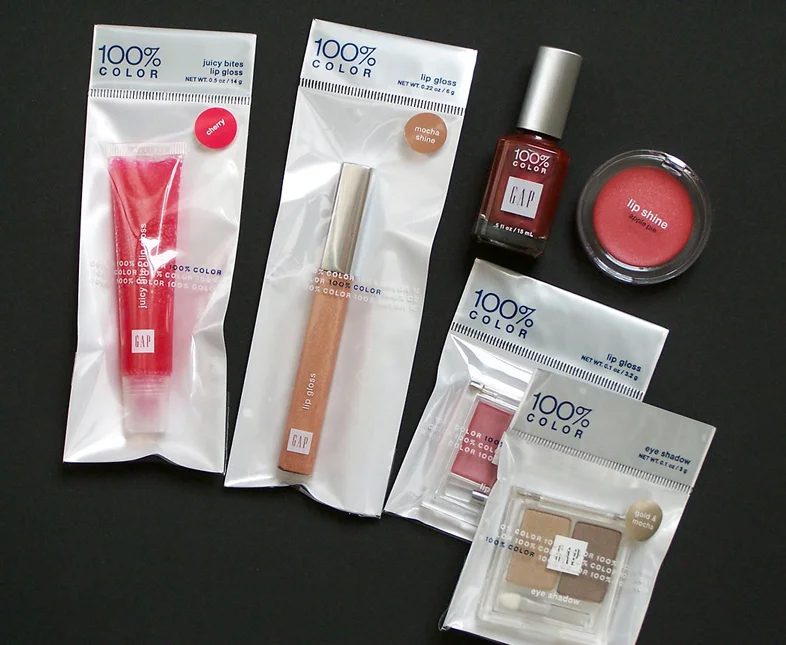
An upscale looking cosmetics product line was created for a lower price-point offering at Gap Outlet stores. In addition, this "upscale look" vs. "low price-point" theme was carried through each stage of the production process, from concept to completion.
The "100% color" logo was designed to emulate the stark, bold flavor of the existing Gap logo, but stands alone as a brand mark with understated chutzpah. The matte-silver color on the inexpensive bags makes the outer package look more refined. These bags are produced at a very high volume at low cost. The use of blue and white with minimal typography keeps the emphasis on the product and brand mark. Once the bags are assembled, a separate vendor applies the more expensive "flavor" label to each bag, with the color matched to the individual make-up or lip gloss color. Same bag each season, but different labels as seasonal offerings dictate.