branding & identity | packaging
Brew Revolution
When the founders of Barefoot Coffee Roasters sold their million dollar empire and moved to El Salvador, it was time to rethink the meaning of freedom. In that single act a new brand was born, and THAT brand is the Brew Revolution. When we put our money where our mouth is, old skins are shed and new friends become beer lovers. Turning coffee roasting expertise into a flavor experience across liquid mediums. Brand psychology. Naming. Employee as brand evangelist.
The concept behind Brew Revolution was first to combine coffee and beer into a single go-to meeting place concept; coffee bar over here, beer bar over there, and friends in the middle. Put simply, some of the best conversations happen over beer or coffee. When investor front-pocket coin goes gun shy, however, then leaving San Salvador and moving to the beach town of El Tunco on the pacific coast becomes the focus of creating a craft beer life-story.
"She'll have another yellow one, and I'll stick with the green."
creative direction | editorial voice | strategy
Weird Mountain View blog
I've lived in Mountain View since 2004 and know this town pretty well. There is a boom happening, growth is explosive, and the time to act is NOW. Teleki Design is right downtown and I need a bigger piece of the action. As my business plan for Teleki Design shifted more towards becoming the local go-to graphic designer, I created Weird Mountain View as a way to get to know folks around town better. The goal of this blog is to document the change as it happens through writing, photography and action.
The question remains: "Does Mountain View want it bad enough?"
art direction & visual design | front-end development | project management
Intuit App Center
There are many apps that work with QuickBooks, Intuit's signature software. The goal of the "Intuit Apps Showcase" event was to bring together the developers of these apps in competition. The event was promoted, and then, on the day of, a live broadcast was available for those who could not attend in person. After the showcase, the winning apps were featured and the pitch of each contestant could be watched online.
Teleki Design created the art direction, visual design, and front-end development of all online properties to work seamlessly with an existing video hosting product. Our art direction was also used for the live in-person event and implemented by another design team.
art direction | design | illustration
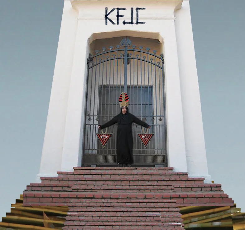
KFJC
The 2013 KFJC Mayhem guide honors the memory of Phil Hertz (DJ Cy Thoth); poet, radio DJ, friend and gentleman. Cy Thoth's show The Firebunker was a KFJC staple every Thorsday (as he called it) for 7 years. His microphone delivery was poetry as aural pandemonium and included phrases like "let us listen to the voices of the damned and the possessed as they ingest the narcotic carcasses of the gods and descend the spiral staircase into the netherworld." He would then play a "juxtaposition or mix" such as an 18-minute doom metal track and a Samuel Beckett record side-by-side. Cy Thoth's on-air and real life personae defined showmanship as everyday art.
The idea for the tribute illustration contained in the guide came about because Cy Thoth died the same week as the papal inauguration, in mid-March 2013. Thus, the leader of The Firebunker stands atop his bamboo pyramid as the cardinals profess their obedience. One of his poems is also used as artwork for the guide.
The "Month of Mayhem" on KFJC features a whole month of special radio programming. The program guide is printed at 12" x 18", folded, and mailed to listeners.
identity | packaging
Gap
An upscale looking cosmetics product line was created for a lower price-point offering at Gap Outlet stores. In addition, this "upscale look" vs. "low price-point" theme was carried through each stage of the production process, from concept to completion.
The "100% color" logo was designed to emulate the stark, bold flavor of the existing Gap logo, but stands alone as a brand mark with understated chutzpah. The matte-silver color on the inexpensive bags makes the outer package look more refined. These bags are produced at a very high volume at low cost. The use of blue and white with minimal typography keeps the emphasis on the product and brand mark. Once the bags are assembled, a separate vendor applies the more expensive "flavor" label to each bag, with the color matched to the individual make-up or lip gloss color. Same bag each season, but different labels as seasonal offerings dictate.
art direction | illustration
Teleki Design
This illustration has seen many transformations and is currently used as the feature image on our twitter and facebook accounts. Originally created as a concept image for the Brew Revolution vs. Teleki Design mutual admiration society, the photo illustration depicts Jack Grisham (TSOL) driving Lou Reed around town in a vintage Mercedes. Most recently, with the passing of Lou Reed, the angel halo + devil horns were added to acknowledge the complexity of the man. Jack Grisham is still alive we think. The paint drips are taken from the interior walls of the Teleki Design studio (actual photo shown). We like to put everything up on the wall during the design process.
Limited edition The Alley T-shirt features all the artists from the first 6 NoiseHaus events silk-screened on the T-shirt.
M, L, and XL available. Only 25 printed. Shirts silk-screened by Black Arrow printing in Mountain View.
Only $12 Stop by and pick one up!
art direction & design | illustration
Hi/Lo Film Festival
For the 10th anniversary of the High Concept Low Budget film festival, we acknowledge the simplest concept of gathering to show a film. A flashlight casting its glow against a brick wall is our bold, raw translation of this idea, drawn in a crude, but brightly-lit illustration style. Festival postcards, posters, DVD cases, lanyards and web banners were created with this look and feel in place.
art direction & identity | poster design
San Francisco Bay Guardian and Ian Brennan
The "Live Nude Bands" event is a typical battle of the bands contest where bands perform for an audience who then get to vote for their favorite performer. What make this contest different is, the winning band had to (got to) play again LIVE AND IN THE NUDE. All proceeds from the event went to a local charity. The event poster model is Barry Ward from RKL/Crosstops; a good sport indeed.
responsive web design | strategy
Mountain View General Store
Teleki Design held a contest and promotion during the 2013 A La Carte and Art festival in downtown Mountain View. Anyone who checked in at Teleki Design on facebook was entered to win a logo, website and competitive analysis for FREE. Well, another downtown local business called The Mountain View General Store was the lucky winner, and what you see here is the resulting website. Since the MVGS features many hand-made works from local artists and makers, we went with a homepage style that showcases much of the latest talent in the store at a glance.
We have since become great friends and are representing other downtown businesses as members of the Central Business Association Board of Directors. Teleki design continues to offer the responsive website deal at a competitive rate to other local businesses with the MVGS website on one of our promotional postcards.
identity | packaging
Filmmaker Mary McDonald
We are humbled to have created the logo and visual style of the DVD package and website for this groundbreaking film. A statement from the filmmaker about Nisei Stories is here:
"Thousands of American citizens of Japanese ancestry were in Japan in 1941. They were unable to return to the United States until after the Second World War had ended. Interviews filmed for Nisei Stories of Wartime Japan allow a few of them to relate their experiences in their own words. This documentary reveals the reasons that these Americans were in Japan, often related to social customs and political conditions in the 1930’s and early 1940’s. It details struggles with food shortages, bombing raids, conscription into the Japanese military, and survival that affected everyone in Japan at that time. Interviewees recall coming home to families who had been relocated and returning to a much changed post-war United States."
art direction & design
KFJC
For the 13th anniversary of the Live from the Devil's Triangle double-CD live music compilation, we had to acknowledge the number 13 in all its loaded glory. Various themes of bad luck were explored around this concept including compact digital discs designed to look physically damaged. Interestingly, the final printing of the CDs yielded a mismatch of different shades of black on the inside booklet. While it was likely the shameful pre-flight omission of an RBG to CMYK black conversion, we'd like to believe it was just plain bad luck.
art direction & design | photography
Hi/Lo Film Festival
For the 8th anniversary of the High Concept Low Budget film festival, we took inspiration from the infamous SNL cowbell skit "I got a fever, and the only prescription is…(replacing 'cowbell' with 'Hi/Lo')." The idea departs in its own direction, as the prescription bottle and unkempt fingernails of the hand holding the bottle become the focal point. The festival messaging was printed out on the bottle and the final image was re-shot on half-a-dozen different occasions until just the right light and readability were achieved. Festival postcards, posters, program guides, DVD cases, lanyards and web banners were created with this look and feel in place.
illustration | packaging
Gap
The core line for 100% color represents the non-seasonal day-to-day collection. However, built into the packaging system is an allowance for seasonal offerings such as Halloween shown here. These custom illustrations are future-crude playful characters living on nail files, mints, bath fizzes, and bars of soap. Their popularity spread to PJs and boxer shorts. The black bat boxer shorts sold out in 130 Gap Outlet stores.
web visual design
Intuit Health Patient Portal
Visual design of the marketing website for Intuit Health Patient Portal and visual design of several product templates for small to medium sized practices and would be customers of Intuit Health. Since the creation of this website, Intuit Health was sold to Medfusion, but the design of the marketing site is mostly intact.
pitch | packaging design
C2SV Festival
We attended the inaugural Creative Convergence Silicon Valley festival in San Jose representing the Weird Mountain View blog. This festival emulates South by Southwest where tech conferences live by day and music venues light the night. C2SV IS Silicon Valley, Woz by day, James Williamson and Iggy by night, ya dig? Well what about doing a C2SV in Mountain View?
The pitch.
Shown is our concept for a take-home CD case PLUS fold-out festival map. Old school CD case technology meets newer school USB drive! Rock 'n Roll and technology together in one keepsake takeaway. The tech-and-go-party concept exploits the brilliant geography of downtown Mountain View. Here, dozens of start-ups are within a 5 block area and these folks are itching for some South Bay action once they get off work. Plus, those company bus rides can get awfully tense on their way back up to Frisco to drop those kids back off in the Mission. Rage in Mtn. View thinks we. Stay tuned…
art direction | design
KFJC
Broadcasting from Foothill College, KFJC 89.7 FM in Los Altos Hills has existed for about 53 years now. We've designed 7 program guides and 4 CDs for the station. This program guide is the most recent and one of our favorites. We wanted the text and visual style of this printed guide to emulate the experience of listening to audio soundscapes on KFJC.
The guide is printed at 12" x 18", folded, and mailed as part of a yearly fundraiser. Illustration by Shelby Hohl.
Limited Edition T-shirt available July 1st exclusively at the Mtn. View General Store.
2 color silk screen. Baby-soft cotton.
S, M, L, XL.